

What follows is a candid and unedited episode from my life. Well, some things were edited I guess. I apologize if the graphic details are disturbing. Some of the events are explicit and may be difficult to read, but I think it’s important that the truth is out there.
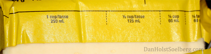
I like butter. I cook with butter. Because I cook with butter, I have to measure butter. Luckily, butter packaging is printed with handy little markings so you can easily cut off just the right amount without messing up any measuring cups. alas, the iconic butter package has its limitations, for it only marks the first two 1/4 cups, then a 1/2 and then one cup.
What horrible, terrible design this is.
It means that if I cut off the first two quarter cups, and then I want to cut off another 1/4, I am forced to awkwardly lift the butter over to the markings with my bare hand so I can accurately measure. It’s a messy process, but this is the unpleasant, harsh reality of butter measuring.
Then a couple of years ago I discovered that I have been subjected to a lifetime of unnecessary frustration and greasy fingers caused by bad butter packaging.
So, what, might you ask, was my moment of illumination? Brace yourself.
Like I did so many times before, I took a package of butter from my fridge and opened the flap to reveal the measurement markings. I gasped. For upon this particular package were markings for every 1/4 cup starting at one end and preposterously continuing all the way to the other. First one 1/4, then another, then absurdly, another six individually marked 1/4 cups divided the entire two cups contained within this butter package. It didn’t end there. Every 1/3 cup was marked as well.
How could this be? Everyone knows that a butter package has the first two 1/4 cups marked, then 1/2, then one cup. But not any more! My heart raced and I squinted at the label: Selection brand. It was from my local Food Basics.
At first I was furious thinking back at countless years subjected to slipshod butter packaging negligently flaunting perfunctory measurement markings. However, the joy I experienced at the sight of this perfect butter package filled my heart with smiling images of easy future butter measuring. The world had been liberated from unspeakable butter package design.
But no. No? That’s right, no. No, I bought butter from another shop and its antiquated inadequate markings mocked me, in a way that only butter packaging can. I bought yet another brand from another shop and discovered the same. Surely other brands would eventually follow suit?
To make a two-year story considerably less so, I am sad to announce that the only butter packaging I have found to show the world what measurements can be is Selection brand butter. Could there be others out there? Perhaps in shops I don’t go to in towns I have never visited? One can only hope.
I do so love good design. When good design is simply a matter of printing a few numbers and nobody does it, I face palm.
