
 I just finished the prototype for a custom type style to be used in my new book project. This is a special joy for me. I have filled dozens of notebook pages with preliminary scribbles and scrawls to find a type style that is appropriate for my new book. I think I’ve finally nailed it, although I’m sure it will still evolve.
I am a typography fanatic. One of my most treasured books is called “The Univers by Adrian Frutiger”, written by professor of typography Friedrich Friedl. I picked it up years ago in The Danish Museum of Art & Design located in Copenhagen, Denmark. This book opened my eyes to the intense passion Frutiger has for clear and concise communication. He slaves over every curve and line in his type design to create a unified and harmonious typeface in all its weights. His typeface “Univers” was first published in 1957 (the same year Helvetica debuted) and remains a remarkable typeface still very much in use.

A sample of text from the book Eight Pound Fly. The baseline is intentionally meandering.
Having said all that, I have never endeavoured to create my own typeface to rival the work of Mr. Frutiger. My text design is never truly original. I love mixing and matching ideas from dozens of existing fonts. My own “fonts” remain hand-drawn with all their variations and rough flaws left unpolished. It’s just a creative impulse that I’d rather not control too much.

Sample of text from the book Dwellers of Lurching Swill.
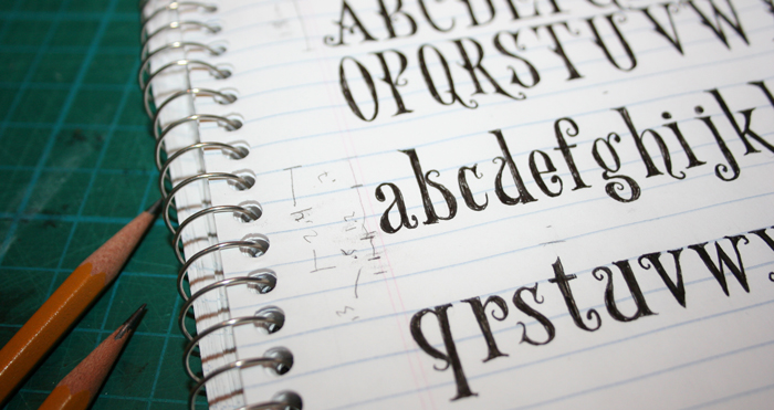
As with previous projects, I’ve written out the roman alphabet in upper and lower case, but I tend to tackle the rest of the punctuation and glyphs as they pop up. I like spontaneity. It’s for this reason that I hand-render every letter in my books individually. So far, that’s the plan with this book as well.
So, while I love and respect the rules that govern formal typography, I also have a soft spot for erratic inconsistencies that show the hand of the human who created them. I’m sure Adrian Frutiger would not approve.
