Dan Holst Soelberg - Bunnies + Chainsaws closeup

Pattern – an Art Exhibition

Bending Spoons Gallery @

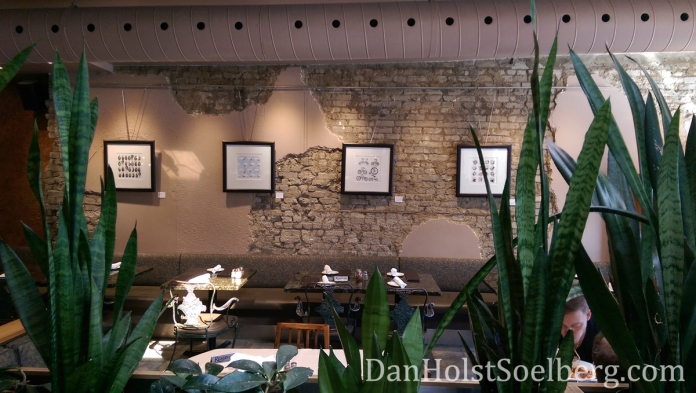
Vesuvio Pizzeria & Spaghetti House

3010 Dundas St W, Toronto

Show Runs until April 29, 2018


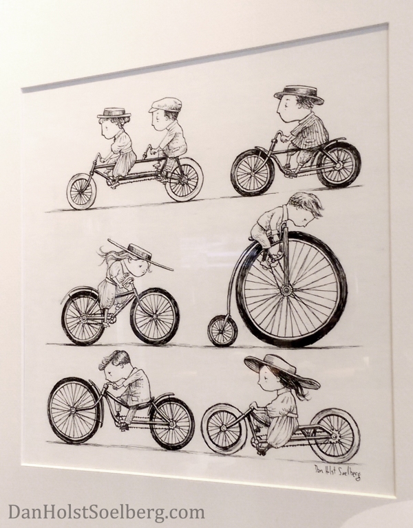
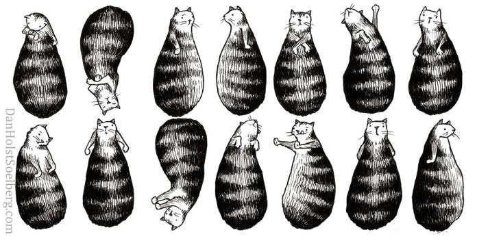
My new art exhibition focuses on pattern. Every piece in this show is a unique and original artwork, but each has also been developed with the intent to become a repeating pattern.

Dan Holst Soelberg - Pattern Exhibition

So, why patterns? Aesthetically, the seamlessness and infinite repetition of pattern is so damn appealing! The artwork that comprises a pattern is simultaneously contained in a finite shape and limitless in the shapes it can fill. There is also something fantastic in the messiness and organic freedom in a hand drawn pattern. Within the bounds of any pattern, there are limitless fun possibilities.

Dan Holst Soelberg - Sunday Afternoon


Pattern isn’t just a superficial aesthetic. In creative expression, pattern and repetition are elemental. Repetition is a powerful tool used in communication, storytelling and art. Our logical minds seek out order (repetition), and any disruption to the pattern of order signifies change that immediately stirs a response from the audience.

Dan Holst Soelberg - Bumbling Dan Holst Soelberg - Circular Growth

Repetition is often used to establish the setting in which we find the hero of a story. Think of the last time you read a book or watched a movie that relies on repetition in the first act to communicate the idea of order or a boring status quo that the protagonist is stuck in. Then something different happens that disrupts the pattern. Something new and out of the ordinary jolts the protagonist out of hum-drum boring into an adventure that sets the plot in motion.

Dan Holst Soelberg - Bumbling closeup

I believe all creative pursuits rely on pattern in some way. This exhibition is my exploration of it.

Due to schedule conflicts, I won’t be hosting a reception for this exhibition.

However, this exhibition is free for viewing at the restaurant now. I will be adding more artwork on April 8. The art will hang in Vesuvio until April 29.

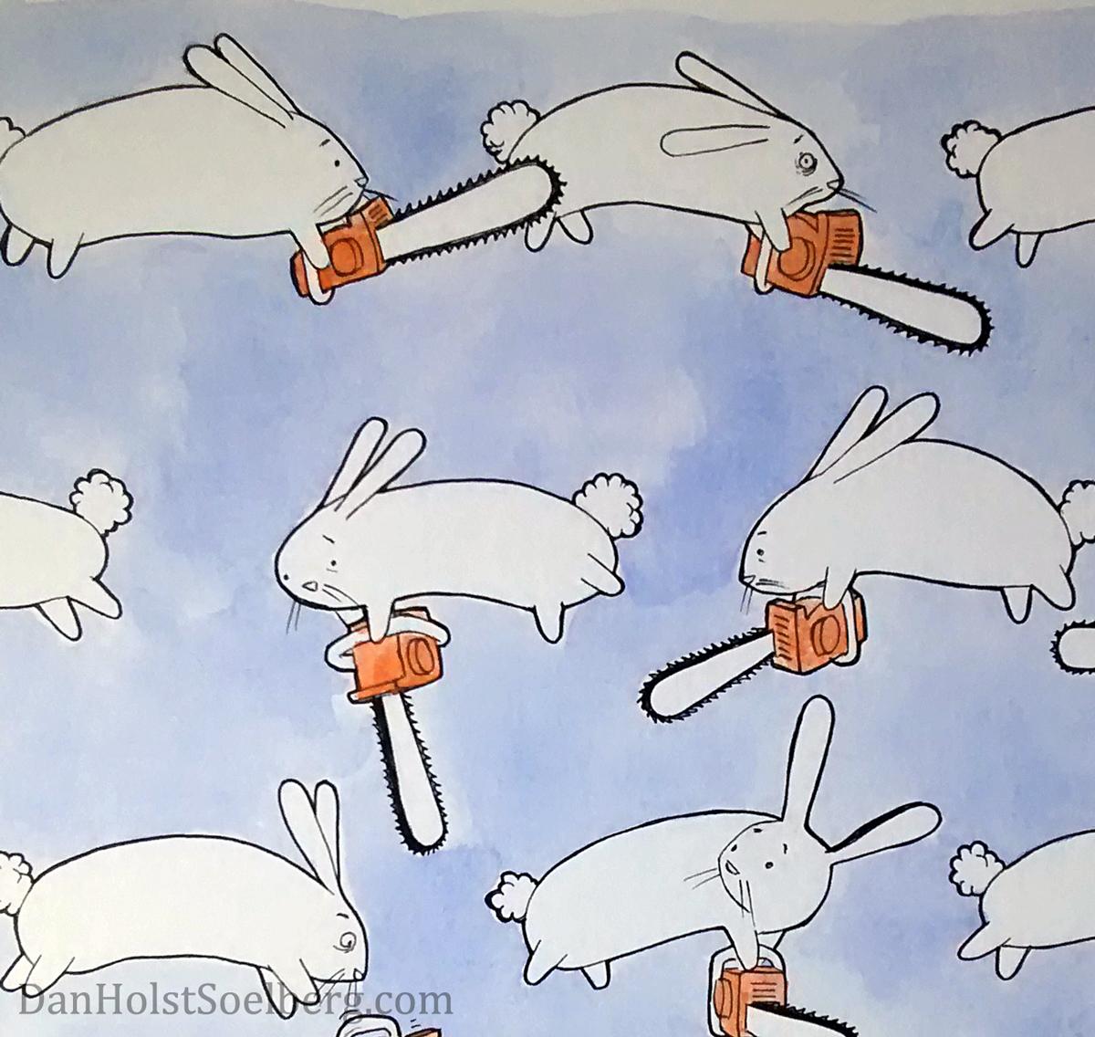
Dan Holst Soelberg - Bunnies + Chainsaws closeupDan Holst Soelberg - Pattern Exhibition


Dan Holst Soelberg - Cat Print Art

Standard

My 2016 Christmas card

Dan Holst Soelberg - 2016 Christmas cardIf someone can tell me how to have more time in a day I am all ears. I’m not talking about wanting to cram more activities into a day, I’m literally talking about having more time. I’ve been thinking about this—if I could add about six more hours to every day I would have just enough time to do everything I want. That’s all. Just an extra six hours. If you know how, let me know.

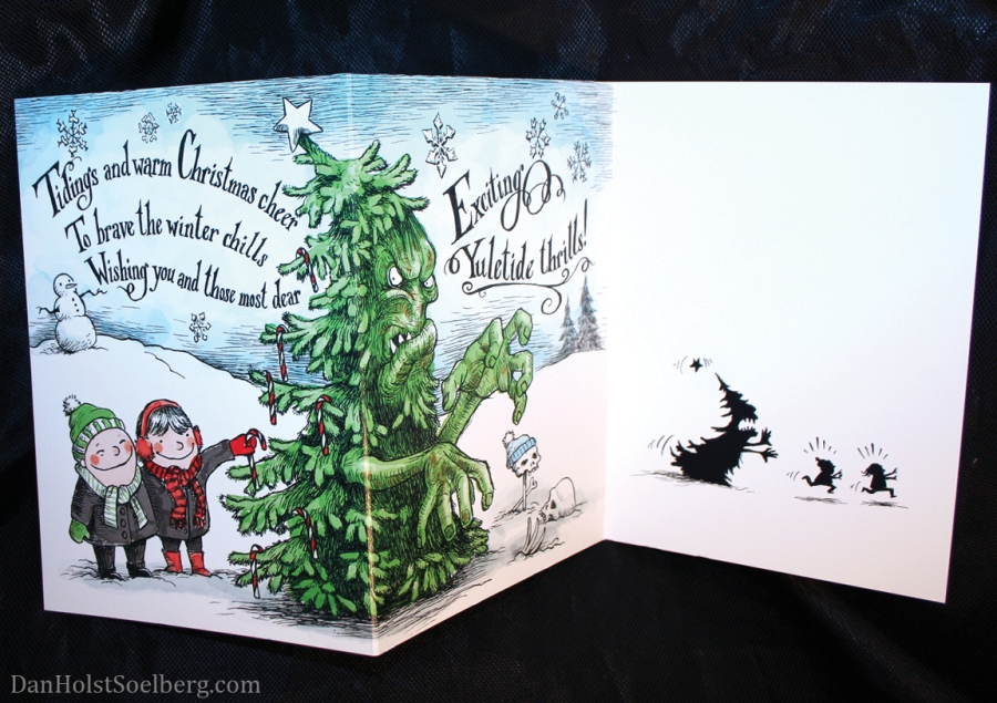
Speaking of non-existent segues, it’s time to unveil my new Christmas card. I’m excited! It’s been a couple of years since my last Christmas card and I’ve had requests for something new. So, I dug deep into my cavernous well of ideas and sketches. Here’s what came out:

Dan Holst Soelberg - Cover of my 2016 Christmas card

Cover of my 2016 Christmas card

Dan Holst Soelberg - inside 2016 Christmas card

And open the card to reveal the horrors that await smiling, candy cane loving children. (click image to enlarge)

What better way to say “bless you on this sacred holiday” than the image of bones in the snow and the threat of bodily harm from a mutant tree? I wrote the poem and sketched this idea a while back but it didn’t feel resolved.

Dan Holst Soelberg - 2016 Christmas card

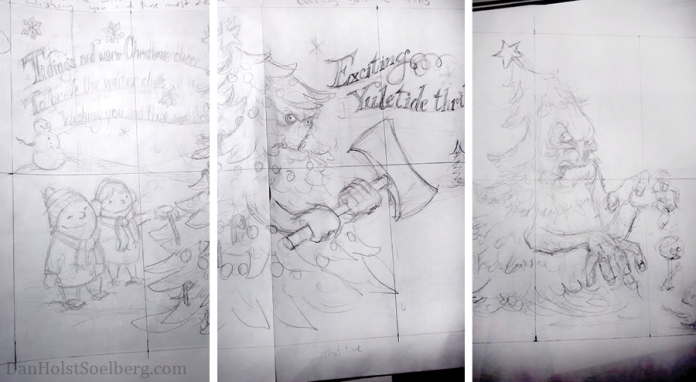
Left to right: Initial sketch of the card front; Original sketch of the axe-wielding tree monster; Revised tree monster with enormous hands instead of the axe. Without the weapon, I wanted his facial expression to be more animated. The ruled lines are drawn to help me figure out the layout, and to transfer elements to the final artwork.

The tree holding the axe didn’t feel quite right. The image is just a little too close to the axe-wielding boy in my headless snowmen card, so I kept sketching until this monster with huge grappling hands emerged.

Because I was strapped for time (seriously, six extra hours every day would be awesome…even just five!) I had to change up my usual process and find ways to speed it up. First, I drew it at 100% scale. Like most artists, I usually draw at a larger scale, but when time’s valuable, a smaller drawing translates to less time.

Second, I really felt that colour was important for this card (rather than my signature black and white). I like watercolour, but it can be finicky and time-consuming. I recently bought a drawing tablet for the purpose of speeding up my process, but for some reason it wasn’t giving me the results I wanted. So, after a few frustrating minutes of failed attempts, I ditched the tablet for my trusty Apple cordless mouse. It did exactly what I wanted and the result is satisfying. I like how the Photoshop watercolour brush can be adjusted to work like the real thing. The happy accidents feel and look remarkably natural. And if a brush stroke isn’t working, it’s such a fantastic feeling to command+z my way out of it!

The card is available for order on my online shop, and I’ll start shipping them out next week. If you want yours in time for Christmas, please place your order now at this link. If you’d rather buy directly from me, just send me an email at dhsoelberg(at)gmail.com.

Dan Holst Soelberg - 2016 Christmas card

Here is the completed pen drawing before applying colour on the computer. Notice the misspelling of “dear”. Photoshop can do wonders! (click image to enlarge)

Dan Holst Soelberg - 2016 Christmas card

Here is the final product, with the silhouettes completing the 3-act play, and punctuating the punchline. (click image to enlarge)

If you want to buy from me personally, you can tomorrow! As mentioned in a previous post, I’ll be selling my wares at Frost Bite in Toronto on Sunday, December 11 at 11am to 8pm. It’s at Pia Bouman School for Ballet, 6 Noble Street, Toronto.

Click here to go to the event’s official facebook page. You can also go to the website for more information: http://theBazaarofTheBizarre.org/


Standard
danholstsoelberg_chicago_trip

Chicago trip, 2017 Calendar & new prints for Frost Bite

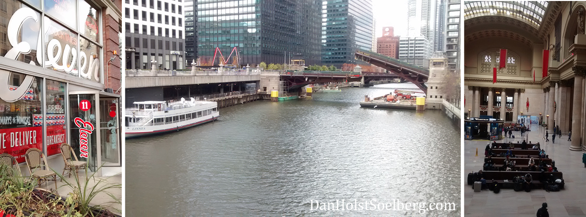
Life’s been treating me fairly well and keeping me far too occupied. Recently, I took an overdue trip to Chicago with my family.

danholstsoelberg_chicago_trip3It’s been more than just a bucket list destination. So many reasons to go and far too many things to do in that blustery city. “Windy City” is not just a cute nickname.
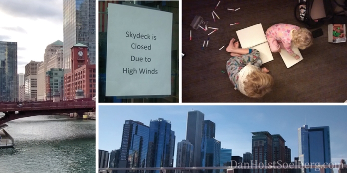
danholstsoelberg_chicago_trip4The famous Chicago Skydeck was not-so-cutely closed when I went due to high winds. Trust me, that little diversion didn’t deprive me of a Chicagorific adventure.

danholstsoelberg_chicago_trip2

Left to right: Art Institute of Chicago; Georges Seurat’s painting “A Sunday on La Grande Jatte”; The L Train was a convenient 5-minute walk from our hotel and took us right into the heart of Chicago

I was fortunate to visit the Art Institute of Chicago, but in retrospect I wish I’d had more time to take in the staggering number of exhibits. I had my own Cameron Frye moment with the famous Seurat masterpiece. It’s only now that I’m home that I seriously regret not going to The Green Mill, a renowned Chicago hot-spot for Jazz lovers. Then again, I don’t know how kid-friendly the place is and I was carting two under-aged offspring. I think a parents-only revisit is something I must plan soon.

In announcements, I am very happy to have the 2017 Shadow Abuse calendar restocked and available in my Storenvy shop.

The first printing sold out quickly! The new calendar features large-scale reproductions of pages from the book Shadow Abuse, and if you have the 2016 calendar, I assure you these are all different. If you visit my shop, you’ll also see several new full-scale signed reproductions of drawings from Shadow Abuse. And in response to requests, the “headless snowmen” artwork from my Christmas greeting card is now a signed print. Click here to see it.

In upcoming events, I’m taking part in the very-soon-to-happen Frost Bite show in Toronto. Expect to see lots of wonderful things to delight your soul and make holiday gift purchasing easy for you. I’m aiming to unveil a brand new Christmas card that conveys the sentiment that I think we all need during the holidays. I’ll post a peek here just before the show starts. Frost Bite happens Sunday, December 11 at 11am to 8pm. Once again, it’s at Pia Bouman School for Ballet, 6 Noble Street, Toronto.

Click here to go to the event’s official facebook page. You can also go to the website for more information: http://theBazaarofTheBizarre.org/

Standard

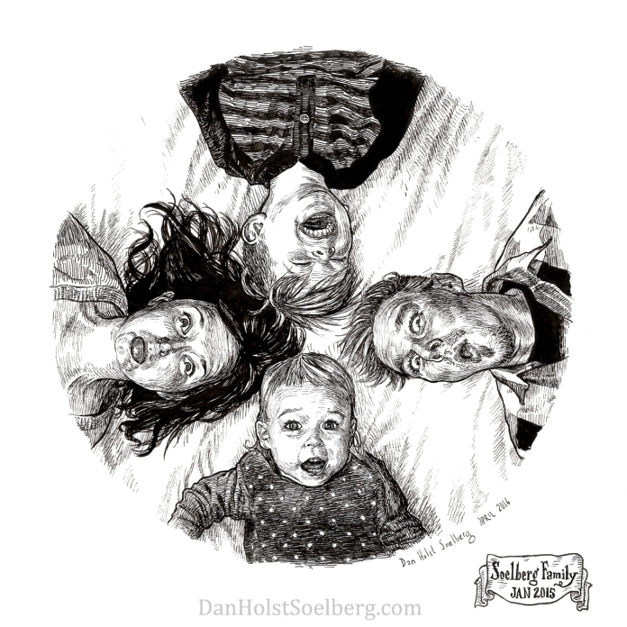
Soelberg family portrait

2015 Soelberg Family Portrait drawing pen

Drawing of the Soelberg family based on photos taken January 2015.

I guess it’s pretty obvious that I find the usual posed portraits kind of dull. I had this idea for a family portrait on my bed in January of 2015. I got the whole family on the bed, took the photos and picked the expressions that seemed to best reveal our moods and personalities. Just as I was about to make the drawing, I was consumed by distraction. Then other priorities took over, and mounting distractions filled my days until the drawing was literally buried under papers. I dug it out last month, finished the pencil drawing and inked it. Getting the personality and expression right is deeply satisfying. When I’m drawing from life, and especially portraits, every line of permanent ink is an exciting act of bravery. It’s a commitment. I’m sure tattoo artists get that same thrill with every bit of ink they commit to flesh.

On a related note, I was contacted just this week by someone wondering if I do commissioned drawings and portraits. Yes I do! Please contact me at dhsoelberg@gmail.com with inquiries. I’ll post a gallery of past commissions to my site soon.

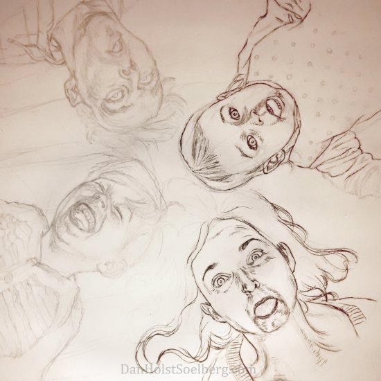
2015 Soelberg Family Portrait progress drawing pencil ink

Here’s a progress shot. Pencil drawing is done and I’ve just started the basic inking.

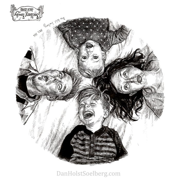
2015 Soelberg Family Portrait (upside down) drawing

Here’s an upside down view of the drawing

Standard

Confession through drawing

Dan and Jaime in photo boothThe online world can be a public confessional. There is something exhilarating and cathartic about letting everybody know who you are without shame. The master of confessional artwork has got to be Robert Crumb. Crumb rocketed to fame with the 1960s underground comic movement. So, when he draws scenes from his own life, they tend to look like comic book stories: they’re graphic narratives that reveal the artist’s psyche and motivations. What makes his confessional work so striking is the uncompromising depiction of Crumb’s own fragile, conflicted human state. He is relentlessly honest and does not censor or edit his thoughts. While Crumb has drawn a lot of attention to his sexual aberrations and self-admitted misogyny, he also has an amazing ability to depict banal, ordinary life. I like those moments. That is what I want to show and I’m not entirely sure why.

Dan and Jaime sleepingHalloweenBall of GreyIn March 2008 I started a personal sketchbook. I had the idea of telling my life’s story through photo booth photos and uploading them to Facebook as my profile photo. The photo booth is a place where we take staged photos, and I like the conversations that happen before and during the moment of the flash. So I’d make a drawing based on a photo and draw speech bubbles to flush out the back story of the moment. The only problem is that the traditional photo booths that use film were quickly being replaced by horrible, lacklustre digital booths. What tragedy! I tried the digital booths a few times and just hated the look of the photos. I refused to use them as drawing reference. Then I couldn’t find any film photo booths at all and my idea died. My heart sank at this cold, digital photo booth revolution. So goes “progress”.

My personal sketchbook also depicts scenes from my childhood, as well as current moments that I’d like to remember. In 2011 I started filming my drawings from blank paper to finished product. I’d edit the footage, add a song to the soundtrack and speed up the movie to fit the length of the song.

Looking at what I’ve filled the pages of my sketchbook with so far, I definitely don’t have any controversial Crumb-esque drawings. Maybe I’m not digging deep enough. While my intent has always been to show ordinary life moments, I’d like to be more confessional in my work. I’ve never truly voiced myself through my work before. It’s time.

Standard

Your name on a bookmark

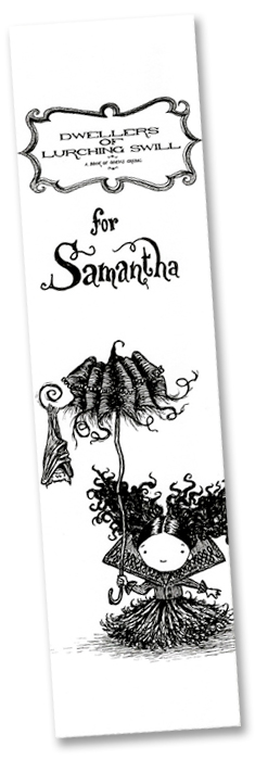
Signed Bookmark - Dan Holst SoelbergThe first time I faced the public with my published book was at the 2008 Mississauga Book Fair in Mississauga, Ontario. I had 100 books printed and they were not cheap. It was embarrassing, really. My little 6″ x 6″ soft cover cost $32. I didn’t know anything about printing books at the time so I just hired a local printer to do it and wound up paying through the nose. To make this expensive little book a little more enticing, I called it a limited first edition and hand numbered every copy. It worked. I sold out.

But I hated the fact that I had only one expensive product. I knew not everybody had an extra $32 burning a hole through their pockets and I wanted to offer some kind of personalized memento. This is way before I got into merchandising. The only other thing I had at my table was a stack of bookmarks. Lightbulb! If someone seemed genuinely interested in my work, I offered to write their name on a bookmark in my signature writing style. Voila, free memento! It really took off. In fact, people were so excited to see their name come out of my pen that I would often get the same person returning with the bookmark in hand, accompanied by others who were pointing excitedly at me and sheepishly getting up the nerve to ask for their own customized bookmarks. Needless to say, the stack of bookmarks didn’t last long.

I’ve done the same thing at every exhibition, convention and fair since. You could say that writing names on bookmarks has become my signature schtick, but it’s more than that. It connects me to my fans in a profound and personal way. People are genuinely honoured that I have taken the time to make something just for them. And it goes both ways. I believe everybody deserves to feel honoured. It humbles me to know that my work is appreciated and I find this moment we share opens up sincere conversation.

Any time I have the opportunity to customize an order I am happy to help. Here’s a short video showing how I personalized a recent order for Barbra.

I met Barbra at Toronto’s Bazaar of the Bizarre in December 2013. I was exhibiting my books and other products and she just happened to stroll by. Barbra was ecstatic about my work so it was an absolute pleasure to customize this for her.

If you see me at a future convention, don’t be shy to ask for your name on a bookmark. It’s what I do. It’s my way to say thank you for appreciating my work.

Standard

For the love of type

New Dan Holst Soelberg typefaceI just finished the prototype for a custom type style to be used in my new book project. This is a special joy for me. I have filled dozens of notebook pages with preliminary scribbles and scrawls to find a type style that is appropriate for my new book. I think I’ve finally nailed it, although I’m sure it will still evolve.

I am a typography fanatic. One of my most treasured books is called “The Univers by Adrian Frutiger”, written by professor of typography Friedrich Friedl. I picked it up years ago in The Danish Museum of Art & Design located in Copenhagen, Denmark. This book opened my eyes to the intense passion Frutiger has for clear and concise communication. He slaves over every curve and line in his type design to create a unified and harmonious typeface in all its weights. His typeface “Univers” was first published in 1957 (the same year Helvetica debuted) and remains a remarkable typeface still very much in use.

A sample of text from the book Eight Pound Fly. The baseline is purposely completely wonky.

A sample of text from the book Eight Pound Fly. The baseline is intentionally meandering.

Having said all that, I have never endeavoured to create my own typeface to rival the work of Mr. Frutiger. My text design is never truly original. I love mixing and matching ideas from dozens of existing fonts. My own “fonts” remain hand-drawn with all their variations and rough flaws left unpolished. It’s just a creative impulse that I’d rather not control too much.

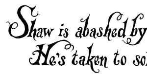
Dwellers of Lurching Swill text sample

Sample of text from the book Dwellers of Lurching Swill.

As with previous projects, I’ve written out the roman alphabet in upper and lower case, but I tend to tackle the rest of the punctuation and glyphs as they pop up. I like spontaneity. It’s for this reason that I hand-render every letter in my books individually. So far, that’s the plan with this book as well.

So, while I love and respect the rules that govern formal typography, I also have a soft spot for erratic inconsistencies that show the hand of the human who created them. I’m sure Adrian Frutiger would not approve.

Standard

Why pessimism is pointless

Cutting illustration boardsI’m cutting illustration boards into 29.8 cm squares (the perfect dimension) for my latest book project and I’m bursting with excitement to get going on the illustrations!

I don’t know about you, but for me there is something irresistible about finding out what someone is passionate about and the projects they work on in private. It’s both fascinating and inspiring. The excitement is contagious. It makes me want to jump headfirst into my own passion-driven projects with renewed vim.

I used to talk openly about anything I was working on with anybody who asked. That’s changed. Now I hold back. What happened to change my mind? I encountered difficult attitudes.

Cynicism, doubt, judgment, arrogance. Take your pick. I can sum them all up with one word: pessimism. I’m sure you’ve met the type. Some malcontented misanthropes take special glee in dumping buckets of cold water on any fresh idea that threatens to spark up. Someone I know has proudly labeled herself a pessimist, claiming that pessimism is better for your health than optimism. She quoted a study that came to this very conclusion. It’s one of those cute and soft pseudo-science factoids of the day that makes for a catchy radio sound bite on the morning commute. Rubbish! I can point to a slew of valid scientific studies that come to the opposite conclusion, so that argument doesn’t hold any water.

The prevailing argument for pessimism is that it is a “dose of reality”. It isn’t. Pessimists molest you with their self-righteous, cranky, glass-half-rotten opinions served on a soured scowl and a kick in your teeth for “your own good”. Don’t get me wrong, I think a healthy dose of skepticism is a necessary part of anything I do. But there is a wide ocean that separates the shores of skepticism from pessimism. They are not the same. Skepticism employs logic and critical thinking. Pessimism is an unresolved childhood.

Am I so thin-skinned that I can’t take criticism from others? Far from it. But pessimists discourage, which is not at all useful. Instead, I often take advice that helps steer my projects in the right direction. For instance, when I self-published my first book I met with publishers, bookshop owners and many other writers and illustrators who have self-published to learn how I can make my own books successful. As a result, I have changed my approach to self-publishing, and three books later I’m still learning and adjusting.

Well, that’s it for today! I’ll make a point of showing you teasers from my new project as it develops. I’d love to get your opinions and advice to make my next book a viral success. In fact, I’m in the midst of promoting my latest book Dwellers of Lurching Swill. Do you know a publisher, do you have a favourite bookshop? Do you know a book reviewer, television show, podcast or a website that could promote my work? Maybe another blog that would feature my book? Please send me your suggestions. Until next time, stay warm!

Standard